The Most Popular Color Palettes for 2026 Interiors
Color trends arrive every year, but only a handful endure long enough to shape how homes actually feel. In 2026, the most popular interior color palettes are not defined by novelty. They’re defined by restraint, adaptability, and comfort—qualities homeowners value once the excitement of a remodel gives way to daily life.
Rather than bold declarations, homeowners are choosing palettes that support space, light, and materials. Color is doing quieter work, shaping mood and cohesion without demanding attention.
Why Interior Color Is Becoming More Subtle
After years of high-contrast interiors and social-media-driven boldness, many homeowners are recalibrating. Color choices that once felt expressive can quickly feel exhausting.
In practice, homes that feel calm and balanced are easier to live in—and easier to adapt over time. As a result, color palettes in 2026 emphasize layers rather than statements.
This shift is less about playing it safe and more about designing for longevity.
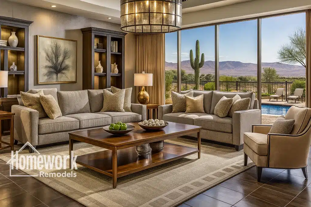
Warm Neutrals Replace Cool Grays
One of the clearest shifts is away from cool gray palettes. In their place, warm neutrals—soft beiges, greiges, and mineral tones—are taking center stage.
These colors:
- Reflect light gently
- Complement natural materials
- Age more gracefully
Warm neutrals perform especially well in desert environments, where intense sunlight can make cool tones feel stark.
Earth-Toned Foundations Gain Ground
Clay, sand, and stone-inspired hues are increasingly used as foundational colors. These tones feel grounded and work well across a range of styles—from modern to traditional.
Rather than dominating a space, earth tones create a backdrop that allows furnishings and architecture to take the lead. Their versatility supports long-term satisfaction.
Muted Greens and Blues as Supporting Players
In 2026, greens and blues remain popular—but they’re quieter. Sage, olive, dusty blue, and soft teal appear as accents rather than primary fields.
These hues connect interiors to landscape without overwhelming them. Used thoughtfully, they add depth while maintaining balance.
Accent walls are giving way to distributed color—appearing in cabinetry, niches, or secondary rooms.
Monochromatic Palettes With Depth
Monochromatic schemes are evolving beyond flat repetition. Homeowners are layering tones within a single family, varying saturation and texture.
For example:
- Walls in a soft neutral
- Trim in a slightly deeper tone
- Ceilings softened rather than stark white
This approach creates continuity without visual monotony and supports architectural clarity.
Color and Material Are Being Chosen Together
Color decisions are increasingly tied to material selection. Paint is no longer chosen in isolation.
Wood species, stone finishes, tile textures, and fabrics inform palette direction. When color and material align, spaces feel cohesive rather than assembled.
This coordination often emerges during whole-home remodeling in Scottsdale, where palette decisions span multiple rooms and surfaces.
Kitchens Favor Soft Contrast
In kitchens, stark white-on-white schemes are giving way to soft contrast. Light cabinetry is paired with warmer counters, or darker islands ground lighter perimeters.
The goal is visual interest without drama. Kitchens feel welcoming rather than clinical, and wear becomes less noticeable over time.
These palettes support both modern and transitional designs.
Bathrooms Move Toward Calm Continuity
Bathrooms in 2026 emphasize spa-like calm. Palettes rely on stone-inspired neutrals, soft whites, and restrained accents.
Bold color statements are reserved for powder rooms or secondary baths. Primary bathrooms prioritize serenity over experimentation.
This approach supports daily use and long-term appeal.
How Light Influences Palette Success
Natural and artificial light dramatically affect color perception. In bright environments, high-contrast palettes can feel harsh.
Successful interiors in 2026 are designed around light behavior—how color shifts throughout the day, how it reflects off surfaces, and how it supports comfort.
Testing palettes in context, rather than relying on swatches alone, prevents regret.
Color as a Spatial Tool
Color is being used to define space subtly. Slight shifts between adjacent rooms signal transition without breaking flow.
This technique supports open layouts while preserving spatial identity. It’s especially effective in homes where openness must be balanced with clarity.
Evaluating layout changes—such as options for removing load-bearing walls safely—alongside palette decisions ensures color reinforces spatial intent.
What’s Falling Out of Favor
Highly saturated colors, extreme contrasts, and novelty hues are becoming more selective. When used, they’re applied intentionally and sparingly.
Homeowners are prioritizing environments that feel restorative rather than stimulating. Color choices reflect that shift.
Choosing Palettes That Age Well
The most popular palettes of 2026 share a common trait: they leave room for change.
Furniture, art, and textiles can evolve without clashing. The home remains flexible rather than locked into a moment.
This adaptability protects both livability and resale appeal.
Process Supports Cohesive Results
Achieving a successful palette across an entire home requires coordination. A thoughtful design-build remodeling process helps align color decisions with layout, lighting, and materials.
When decisions are sequenced intentionally, color feels integrated rather than applied.
Calm Is the New Confidence
Interior color palettes in 2026 reflect a quiet confidence. They don’t seek attention—they support life.
Homes designed with restraint feel composed from day one and continue to feel right as years pass. That is why these palettes endure.
Let’s Choose Colors That Support How You Live
If you’re planning a remodel and want a color palette that feels current without sacrificing longevity, early planning can help align color, light, and materials. You can schedule a free consultation with our design-build team to explore palette options tailored to your home.